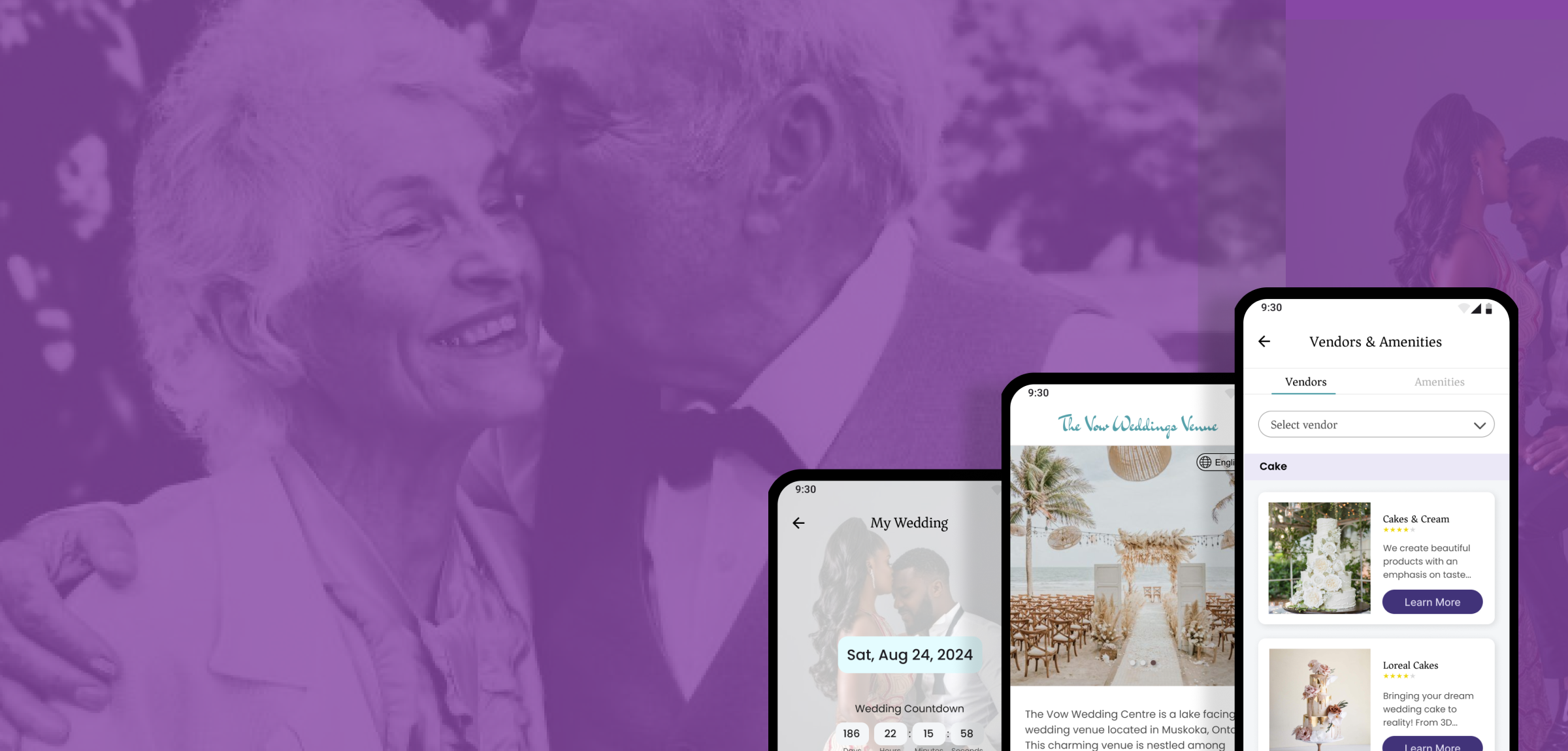
The Vow CaseStudy
The Vow CaseStudy
Designed for your detailed wedding planning.
Background
The total number of marriages in 2022 was 1,985,072 which equaled a marriage rate of 6.0 per 1,000 total population in North America. This is a whooping amount of marriages. Although various couples get married in various ways, It was imperative to meet the needs of those that decide to have theirs at this venue. From Secondary research, budgeting, expenses clashing visions, planning duties and unreliable vendors are some of the identified challenges in this industry. The Vow Wedding Venue is a lake facing wedding venue located in Muskoka, Ontario. This charming venue is nestled among beautiful lakes, and it offers a retreat that would suit those planning a wedding among nature.
Role
I worked on a mobile app that showcases the beautiful venue as well as helps users plan their weddings from any location. I conducted interviews to uncover hiccups experienced by couples who had gone through the planning and wedding process as well as intending couples to identify their worries with regards to planning their weddings. I created wireframes and prototypes and took potential users through rounds of testing.
Timeline - 4 months
Tool - Figma
Process
[This was the process adopted to meet users needs however, it was not linear. There were iterations due to feedback and redesign across the various stages]
User Research
I conducted interviews and created empathy maps in order to gain a comprehensive understanding of the users I am designing for and identify their pain points. A primary user group identified was engaged adults with very busy work schedules.
This user group revealed that cost was not the only reason preventing traveling to view various possible wedding venues as initially assumed, time was a really important factor for them. Other user problems with wedding venue search were lack of comprehensive information online with regards to planning the event, catering to guest logistics and hospitality needs and navigating a different city.
Pain Points
Time
Engaged adults with very busy schedules do not have time to travel to multiple cities/counties for in-person planning
Information
Lack of comprehensive information online about outdoor wedding venues and vendors
Accessibility
Language barrier with accessing some wedding venue websites
How Might We?
From the insights uncovered, there were a few questions developed to serve as a guide through the ideation phase. These questions are actionable and helped to uncover opportunities for design.
1. How might we help users plan their weddings efficiently i.e, reduce planning time and cost?
2. How might we provide a holistic view of the wedding venue?
3. How might we provide helpful planning suggestions for users?
Ideation
At this stage, there was a lot of brainstorming and a few ideas aimed at resolving the issues that were discovered during the interactions with the users at the interview stages as well as information from competitive audits carried out on websites and apps within the industry.
Some opportunities identified were:
A wedding venue app that will enable users plan their wedding and provides access to other amenities.
Provide comprehensive information via the app such as virtual reality to enable planning from various locations.
Incorporate access to local vendors and amenities on app.
Provide in app navigation for physical tours.
In-app venue booking for better management of events.
Expand language options for a wider range of users.
Integrate assistive technology.
Ensure consistency of visual elements for ease of use.
Incorporate virtual tour
Storyboard
Storyboards were explored to depict both big picture scenario of achieving the end goal of a happily married couple and task scenarios such as contacting a vendor via the mobile app, through integrated messaging features, ultimately leading to a smoother and more satisfying customer experience.
Design & Implementation
Wireframes
At this stage, the focus was on the flow and functionality of the app while also including interface details to give more clarity to the purpose of each screen. This allowed for rapid test on usability and navigation.
User Testing, Feedback & Iteration
The wireframes were tested with 5 different participants. I then took the responses through a card sorting exercise to find common themes amongst their observations. Based on the user testing, there were iterations made to the previous design which are reflected in the high fidelity mockups. One of the common themes in this stage that was incorporated was:
Navigation and Current Page Indication: The navigation bar and back arrows had not been inputted at this stage which posed navigation difficulties to the users. The page names were not placed which made testers confused about the current page per time.
Sticky Sheet
The Hi-Fi MockUps
The general theme of the website was maintained as the design followed the brand guidelines.


